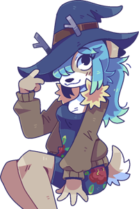
#1
Yrrzy
I'm going to post each fursona and review them in this thread, don't worry if you still want to enter, I'm willing to accept late entrants for the fun of it!

I'm going to review each fursona based on the design brief given to me, and how personal it feels as a fursona. You will not get marks for elements of the design I had to come up with myself, and putting a lot of the design work on me will lose you points.
With that said, nobody loses in Fursona garrison, a low grade doesn't mean a bad fursona. I put the work into making them nice and make them feel appropriate for you.

Additionally, feel free to review them yourself, I'm interested to know what y'all think about each others designs and the work I did to fill in the gaps!
#2
Yrrzy
[Image: unknown.png]
Hearts
First of all I appreciate the amount of detail in the character description, including sources of inspiration - certain characters leaving a mark on you is very Furry.
There's a good amount of personal details, specific items of clothing and motifs that really put a You touch on it, this is very much Fursona material.
The palette choice being pretty out-there is good too, you could have gone with a realistic palette but wanting a specific colour is a great piece of personalisation that can really Make a fursona.
While I didn't draw it, since I'm not gonna draw him with his clothes off, specifying a fur pattern (as a potential location for a heart motif) is another good touch that I appreciate in personalising fursonas.

Overall this fursona is well thought-out; very Personal and very Furry, I give it an A.
#3
Yrrzy
[Image: unknown.png]
Seal
It took a bit of pressing to get you to give me the details, but they're well thought out and personal.
I get the sense that you were a little embarrassed given that, maybe you thought they'd be revealing? Or just embarrassed to be seen with a fursona?
Idk, maybe I'm reading into that too much, but the design was both personal and aspirational, which is an extremely good vibe for a fursona
Good palette decisions, updating the colours after seeing them on the finished art shows you care about it, although you didn't give me much to go on for the fur(?) colour/pattern.

This is a good fursona tho, aspirational design is Peak Fursona and I do really like the result. I have to give you a B with your only lost mark being that I had to come up with the body palette myself.
#4
Yrrzy
[Image: unknown.png]
Mfan
I considered making this anthro, despite your specification, just to spite you, but tbf a Capybara is a fun animal to draw.
Otherwise tho you didn't really give me anything besides the mario hat. I expanded it to a full mario costume myself.

D, the only reason this isn't an F is because it's pretty representative in how lame of a design it is, and Capybaras are good.
#5
Yrrzy
[Image: unknown.png]
Zelma
I mean, it's unapolagetic, whether you intended that or not, it's a very Zelma fursona.
I appreciate you picking out the exact outfit, it kind of puts me in mind of My Immortal when combined with the Aesthetic.
I'm not going to draw it but I guess you designing your fursona's Penis isn't exactly out of place when it comes to Fursona design so points for authenticity I guess.

Half of this character design was just a request for pornography tho, so the best I can give you is a C.
#6
Yrrzy
[Image: unknown.png]
Amoeba
This is definitely a design that screams "Yea this is Amoeba".
This is the only fursona in this garrison that I'm aware at least partially existed or was thought about before.
I appreciate the palette specificity for the accents, however "normal moth colour" isn't super specific.
I love the design idea though, the maid with a feather duster tied in visually to the antennae and conceptually to the moth dust thing.

Even though you didn't give me the full palette, the design and genuine feel of the fursona wins enough points back that I just can't not give it at least a B.
#7
Yrrzy
[Image: unknown.png]
Kright
Another fursona where I appreciate the design considerations of accents and palette warmth.
Wanting a fluffy tail is a good reason for an animal choice, one of only two fursonas in this Garrison to specify a reason for the animal choice.
That combined with the details from yourself IRL, such as hair and clothing makes it a very Personal fursona.
You didn't specify much in the way of fur colour and pattern but the choice of a fox does make that less necessary.

Yeah, with a simple design like this there's nowhere to really lose marks so I can't help but give this one another A, good all-round fursona.
#8
Yrrzy
[Image: unknown.png]
Two Finger
You didn't give me much here tbh, which doesn't give me a whole lot to review, but I did my best to make smth that felt You.
Fall clothes was a nice personal detail though, I don't want to fail it. The barren brief nets this a D at best, but nobody loses in fursona garrison and I hope you enjoy the design anyway.
#9
Yrrzy
[Image: unknown.png]
Fun With Despair
This is 100% distilled Fun With Despair energy. Like; Witch Hat, Plague Doctor, Scarf, Coat, Spooky Palette - That's Despair Babey!!!!!!
You did carefully obscure the details which indicate its a fursona, but we all know :)
That being said, maybe you had that in mind when you designed it, allowing you to use it without embarassing yourself. :))

In any case, a crow with with a plague doctor mask is funny, and this is the most personal fursona design so far, I just gotta give it an A+.
#10
Yrrzy
All of that said, the letter grades don't correspond directly with which designs I like the most.
Despite not getting the top grades, Seal's and Amoeba's are my two favourites!
[Image: yrrzy.gif]

Users browsing this thread:

Forum Jump:

";