Suggestion/Undertaking: Vectorize the hidden MFGG icons


![[Image: mrymmo.PNG]](https://a.pomf.cat/mrymmo.PNG)


![[Image: JrF8FaQ.png]](http://i.imgur.com/JrF8FaQ.png)

I agree
though tbf if you're doing them by hand and not with filters then it might be cool, though that's quite a bit of work
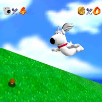
that king yoshi looks pretty good
though tbf if you're doing them by hand and not with filters then it might be cool, though that's quite a bit of work
that king yoshi looks pretty good


![[Image: s2n7oi.png]](https://files.catbox.moe/s2n7oi.png)


![[Image: X7N0qAG.jpg]](http://i.imgur.com/X7N0qAG.jpg)
for example, svg
 could be called :yoshisvg:
also yeah i don't understand why they're resized. but is there a way to make the non-svg ones SVG anyway but like, when they upscale they look pixelized but clean pixelized? hard to explain it. like, make it out of a bunch of squares?


![[Image: yrrzy.gif]](https://yrrzy.net/images/buttons/yrrzy.gif)

>tfw my username is based on spriting and I still like vectors better
![[Image: supercorrect.png]](https://i.ibb.co/g3J0P4F/supercorrect.png)


vectie is decidedly less badass than spritey though

![[Image: vfzxzh.png]](https://a.pomf.cat/vfzxzh.png)


>A filter would never even approach that level of quality
yeah but it still lacks the charm of the original,Also on your version the nose, mustache, and sideburn look well not like those things as much as the original
things that work at a 16x32 size don't always translate so well to vector and luigi is a good example


Users browsing this thread: